

Your logo looks perfect in Figma at 2000px. The serifs are elegant, the letterforms are balanced, and your client approved it immediately.
Then you see it as a browser favicon. It's a blurry blob. The thin strokes vanished. The details you spent hours perfecting are invisible.
Welcome to the reality where most logos actually live: at 16×16 pixels on a phone screen.
Let's fix this before your next client asks why their logo "looks weird everywhere."
73% of logo views happen at sizes under 64px—favicons, mobile headers, app icons. If your logo isn't designed for small sizes first, it's designed backwards.
The Favicon Test: Where Typography Dies
Here's the test every logo should pass but most fail:
Step 1: Export your logo at exactly 16px × 16px
Step 2: View it at 100% zoom (no scaling, actual pixels)
Step 3: Ask yourself: "Can I recognize this brand?"
If the answer is NO, your typography choices killed the logo.

What Kills Logos at Small Sizes
Serif typefaces with thin strokes → Strokes literally disappear at 16px
Script fonts with connecting letters → Connections become blobs
Multiple font weights in one logo → Creates visual chaos
Small counters (the white space inside letters) → Fill in completely

Get heading + body scales with one click.
Minimum readable stroke weight at 16px is 2 pixels. If your logo has 1px strokes, it will vanish on mobile devices. Test this BEFORE you present to clients.
5 Typography Mistakes That Destroy Logo Legibility
Mistake #1: Too Many Font Weights
When Gap redesigned their logo in 2010, they created a chaotic mess with multiple weights and that random blue square. It lasted one week before public backlash forced them to revert.
The problem? Visual complexity that falls apart at every size except the one it was designed at.

Why this fails: Each weight has different stroke widths. At small sizes, they create inconsistent rhythm and some strokes disappear while others stay visible.
Mistake #2: Thin Strokes for "Elegance"
Luxury brands love hairline serifs. They look sophisticated in presentations. They vanish completely on actual screens.

At 16px, minimum stroke weight: 2px. At 32px: 1.5px minimum. At 64px: 1px minimum. Design your logo at the SMALLEST size first, then scale up—never the reverse.
Mistake #3: Conflicting Font Personalities
Trying to show you're both "modern" and "traditional" by mixing radically different typefaces? You're just showing you can't make decisions.

The fix: Pick ONE typographic voice. If you need contrast, use weight or size—not personality.
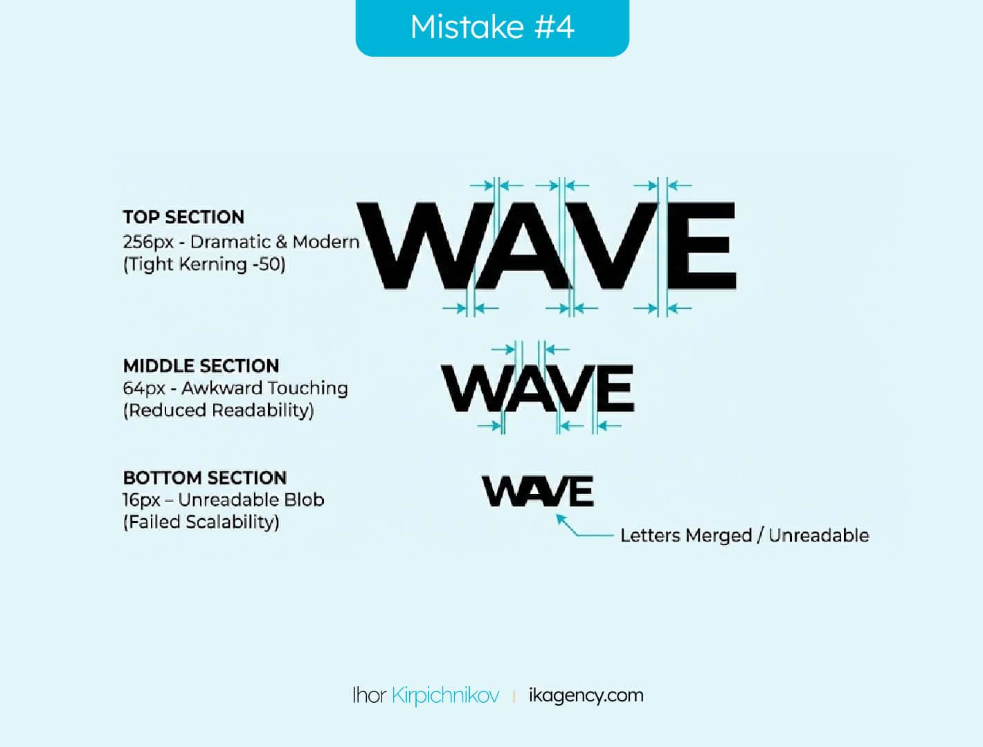
Mistake #4: Poor Kerning Creates Blobs
At large sizes, tight kerning looks dynamic and modern. At small sizes, letters touch and merge into unreadable shapes. (This is why understanding proper tracking and spacing rules is non-negotiable for logo work).
Mistake #5: Wrong Medium, Wrong Choice
Zara's ultra-condensed serif logo works in print magazines and storefront signage. On mobile? It's a vertical smudge.
The lesson: Where your logo lives determines what typography works.

Your logo appears as a 16px favicon more than anywhere else. If you design for presentations and "scale down later," you're designing for the wrong medium.
What Actually Works: NASA's Typography System
NASA's logo is a masterclass in scalability. Let's break down why it survives everywhere.


The logotype uses:
- Bold geometric sans-serif (no thin strokes to disappear)
- Large counters (negative space doesn't fill in at small sizes)
- Single weight (consistent at every size)
- High contrast (red meatball version has clear figure-ground)
The letterforms work at 16px because they were designed with technical constraints first, aesthetics second.
That's the backwards approach most designers miss.
Design your logo at 16px first. Get it working there. THEN scale up and add refinements. This forces you to solve the hard problem (legibility) before you get distracted by the easy one (making it pretty).
Your Logo Testing Checklist
Before you send finals to a client, test these required sizes:
| Platform | Size | Test Question |
|---|---|---|
| Favicon | 16×16px | Can you recognize the brand at actual size? |
| Mobile Icon | 60×60px | Is it clear when viewed at arm's length? |
| Email Signature | 120px wide | Does it read in inbox preview? |
| Social Profile | 200×200px | Does it look professional? |
| Desktop Header | 240px wide | Do the details add value? |
Export every logo at all five sizes. View them in actual context (not in your design file).
If anything fails, simplify the typography until it passes.
Create a Figma/Adobe file template with frames at exactly these 5 sizes. Drop your logo into all 5 frames simultaneously. You'll immediately see what breaks.
The Real Workflow
Here's the process that prevents small-size failures:
1. Start at 16px → Design a recognizable mark at favicon size
2. Test at 60px → Add detail that enhances (not decorates)
3. Scale to 240px → Refine proportions and spacing
4. Validate at 512px → Check if refinements still make sense
5. Export all variants → Create the full size range
This workflow forces functional decisions first.
Most designers do this backwards. They design at 2000px where everything looks good, then try to "make it work" small. That's why logos fail.
Typography Specs That Work
These technical specs prevent most logo failures:
Minimum Stroke Weight by Size:
- 16px: 2px minimum stroke
- 32px: 1.5px minimum stroke
- 64px: 1px minimum stroke
- 128px+: Any weight works
Counter Size (negative space inside letters):
- 16px: 25% of cap height minimum
- 32px: 20% of cap height minimum
- 64px: 15% of cap height minimum
Letter Spacing:
- 16px: +10-15% looser than normal
- 64px: Standard tracking
- 256px+: Can go -5% tighter for impact

Export formats you need: SVG (scalable master), PNG at 1×/2×/3× resolution in sizes: 16px, 32px, 64px, 128px, 256px, 512px. Favicon: ICO format with 16×16, 32×32, 48×48 embedded.
Your logo will be seen at 16px more than any other size. Design for that reality, not for the presentation deck. If it doesn't work as a favicon, it doesn't work.
The Bottom Line
Typography in logos isn't about finding the prettiest typeface. It's about choosing letterforms that survive in the real world.
That means:
- Testing at 16px before you get attached to details
- Using stroke weights thick enough to remain visible
- Creating counters large enough to stay open
- Avoiding complexity that only works at presentation sizes
Most logo failures happen because designers optimize for the design file instead of the browser tab.
Don't be that designer.
Start at 16 pixels. Scale up from there. Test everywhere it'll actually live.
Your next logo will thank you.
- Design logos at 16px FIRST, then scale up—not the other way around
- Minimum stroke weight at 16px is 2 pixels (anything thinner disappears)
- Counter space should be 25% of cap height at small sizes
- Test every logo at: 16px, 60px, 120px, 200px, and 240px before delivery
- Use bold geometric sans-serifs with large counters for maximum scalability
- Avoid multiple weights, thin strokes, and conflicting typeface personalities


