

Choosing between serif and sans-serif fonts isn't just about aesthetics—it's about communicating effectively across devices and platforms. Whether you're crafting a logo, designing a website, or laying out a magazine, your font choice can make or break your project.
This guide cuts through the noise to help you understand when to use each typeface, how they impact readability, and what they communicate about your brand.
Understanding Serif vs Sans-Serif: Quick Definitions
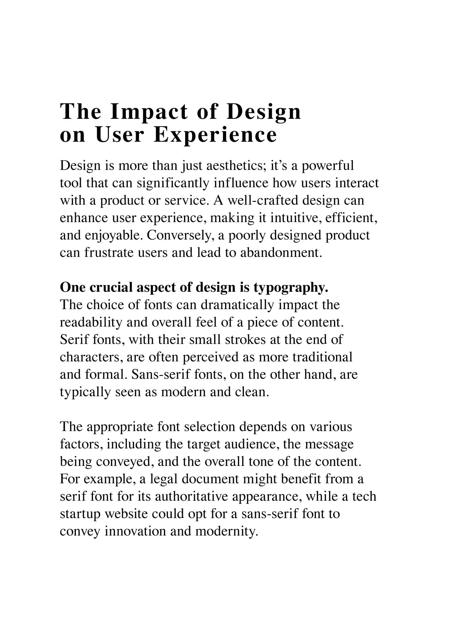
Serif fonts have decorative strokes (called serifs) at the ends of letters—think Times New Roman. These small lines give the typeface a traditional, often elegant look.
Sans-serif fonts don't have these extra strokes. "Sans" means "without" in French, so these typefaces are clean and straightforward—like Arial or Helvetica.


Serif fonts often feel traditional or elegant, while sans-serifs come across as modern and straightforward. It's like choosing between a classic tuxedo and a sleek jumpsuit—both look great, but in different settings.
When to Choose Serif Fonts
Serif fonts shine in specific scenarios where tradition, authority, or readability in print matters most.
Print Design Excellence
Those little strokes guide the reader's eye from letter to letter, making long passages easier to digest. Magazine spreads, book layouts, and printed reports often use serifs like Garamond or Baskerville for this exact reason.

Traditional & Luxury Branding
Law firms, high-end fashion brands, and classic literature publishers rely on serif fonts to communicate authority and sophistication. A slab serif on a history book cover practically screams "authoritative source."

Context is everything. While serifs excel in these areas, creative rule-breaking can yield striking results. Trust your designer instincts and don't be afraid to experiment.
When to Use Sans-Serif Fonts
Sans-serif fonts dominate digital design for good reason—they're clean, modern, and highly legible on screens.
Digital & Web Design
Sans-serifs render more crisply across various devices and resolutions. Their clean lines remain clear even at tiny sizes, making them perfect for mobile interfaces, websites, and app design.

Modern Branding
Tech startups and contemporary brands use geometric sans-serifs to convey simplicity and forward-thinking. They create a sense of space and airiness that makes even complex information feel more digestible.
Small Screen Readability
Smartwatches, mobile phones, and tablets benefit from sans-serif's simple forms. Where serifs might blur at small sizes, sans-serifs stay sharp and readable.

Brand Personality Through Font Choice
Fonts trigger emotional responses. Serif fonts evoke tradition, reliability, and sophistication—perfect for luxury watches or legal services. Sans-serif typography suggests modernity, clarity, and straightforwardness—ideal for tech companies or minimalist brands.
The key is matching your typeface to your brand values and target audience. A children's brand might choose a rounded sans-serif, while a law firm sticks with a serious serif like Times New Roman.
Practical Font Pairing Strategies
Mixing fonts effectively creates visual interest and hierarchy. Here's what works:
Combine a bold sans-serif headline with serif body text. This creates clear hierarchy while keeping things interesting. Example: Arial for headers + Georgia for paragraphs.
Creating hierarchy: Use different weights and sizes to guide the reader's eye. A Helvetica heading paired with Baskerville body text offers striking yet harmonious contrast.
(For a deep dive, read our guide to typographic hierarchy and weight).
Tools that help: FontPair and Typ.io offer great starting suggestions, but trust your eye and experiment. The golden rule? Fonts should complement, not compete.
Readability & Accessibility
Readability isn't just about the typeface—it's about context.
In print: Serif fonts often win for long passages. Those little strokes guide the eye naturally.
On screens: Sans-serif fonts typically render more crisply on digital displays, especially at smaller sizes.
Accessibility matters: Choose fonts with clear letterforms and adequate contrast. Consider users with visual impairments—they need inclusive design, not just aesthetic choices.
Responsive typography: Your text must remain legible from smartwatches to 4K monitors. Use flexible font sizes and proper spacing.
Industry-Specific Font Choices
Tech & Startups: Sans-serif fonts like Roboto convey innovation and modernity.
Finance & Law: Serifs like Times New Roman and Baskerville maintain tradition and trust. Some firms now use sans-serifs for approachability.
Fashion & Beauty: Both work depending on brand personality—elegant serifs for luxury, bold geometric sans-serifs for avant-garde.
Education & Publishing: Readability comes first. Serif fonts like Garamond dominate print, but sans-serifs gain ground in digital textbooks.
Common Typography Myths Debunked
Myth: "Serifs are always better for print"
Reality: While serifs can enhance print readability, beautifully designed print materials use sans-serifs too. Context and execution matter most.
Myth: "Sans-serifs are only for digital"
Reality: Sans-serifs work wonderfully in print, especially for headlines or minimalist designs. Remember, Helvetica was originally designed for print.
Myth: "Never mix serif and sans-serif"
Reality: Combining them creates beautiful typographic contrast when done thoughtfully. It's a common technique for creating hierarchy.
- Serif fonts excel in print, traditional branding, and conveying authority
- Sans-serif fonts dominate digital design, modern branding, and small-screen readability
- Font pairing creates hierarchy—combine serif and sans-serif thoughtfully
- Context matters more than hard rules—match fonts to your audience and medium
- Accessibility is crucial—choose clear letterforms with adequate contrast
- Typography myths shouldn't limit creativity—experiment with purpose


