

- Kinetic typography is animated text that moves, scales, rotates, or transforms to enhance messaging and viewer engagement
- Viewers retain 95% of a message in video vs. 10% in text—motion typography bridges this gap
- 2026 tools range from professional (After Effects, Cinema 4D) to browser-based (Jitter, Rive) to AI-powered (Runway, Pika)
- Core principles: timing, easing, hierarchy, and purposeful motion over flashy effects
- Best use cases: social media ads, title sequences, explainer videos, UI micro-interactions, and brand content
Words don't have to sit still.
In a world where attention spans shrink and scroll speeds increase, static text struggles to compete. Kinetic typography—the art of animated text—transforms ordinary words into visual experiences that stop thumbs and stick in memory.
This guide covers everything: what kinetic typography actually is, which tools to use in 2026, core design principles, and practical techniques you can apply today.
What Is Kinetic Typography?
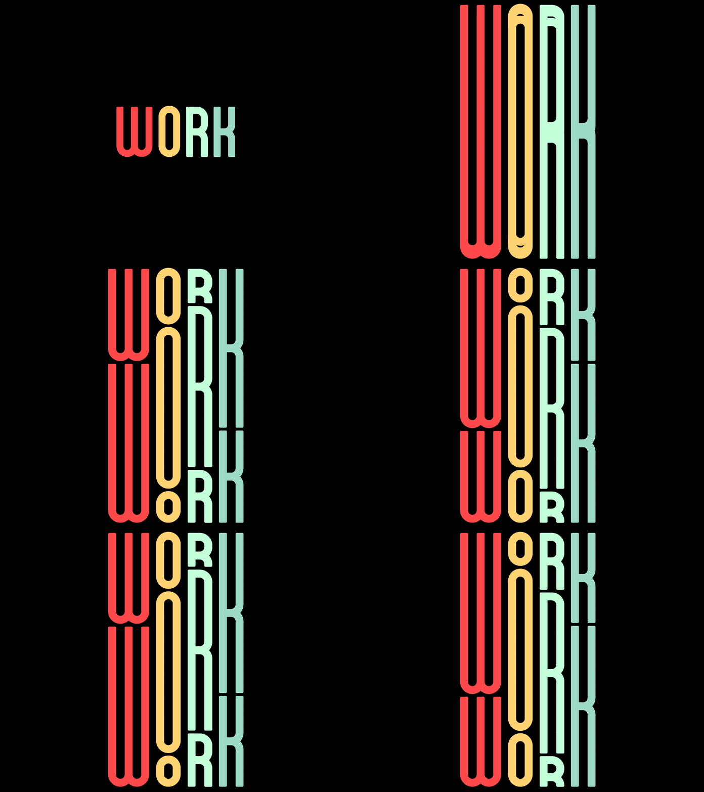
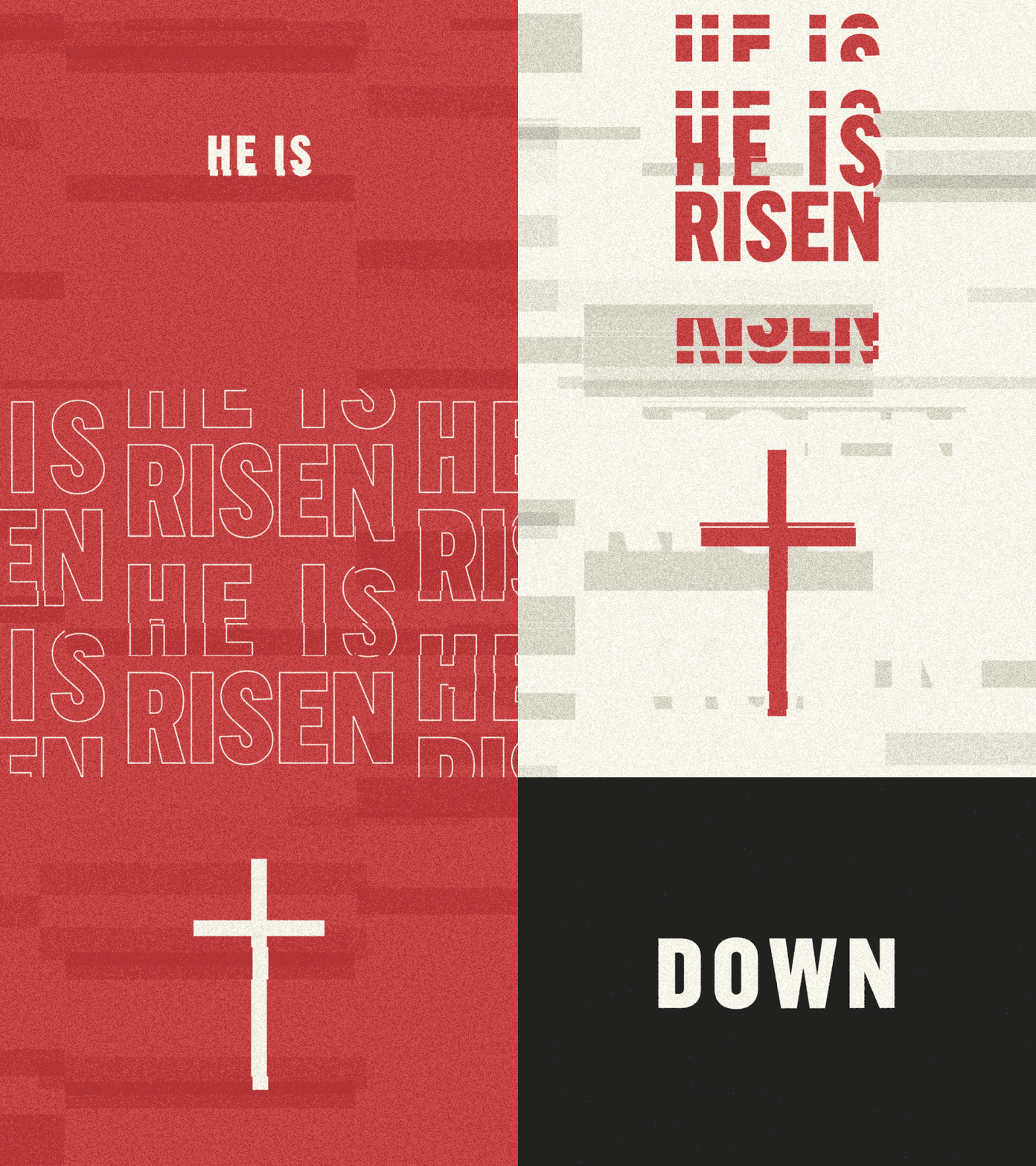
Kinetic typography is text in motion. Letters scale, rotate, bounce, fade, and flow across the screen—synchronized with audio, story beats, or user interactions.
Unlike static text that delivers information passively, kinetic type performs. It guides attention, creates rhythm, and adds emotional weight to words.
(Need help defining levels? Read our guide on structuring visual hierarchy).
Kinetic typography (also called motion typography or animated text) is a design technique that uses moving text to capture attention, convey emotion, and enhance storytelling in video, web, and interactive media.
You've seen it everywhere:
- Movie title sequences — "Stranger Things," "Se7en," Marvel intros
- Social media ads — Fast-paced text overlays on Instagram and TikTok
- Explainer videos — Text synced with voiceover to reinforce key points
- UI/UX design — Loading states, onboarding flows, micro-interactions
- Lyric videos — Words dancing to music
The technique dates back to the 1959 film "North by Northwest" (Saul Bass's iconic title design), but 2026's tools make kinetic typography accessible to anyone with a laptop.
Why Kinetic Typography Matters in 2026
Three shifts make motion text more relevant than ever:
1. Video-First Platforms Dominate
TikTok, Reels, Shorts, LinkedIn video—every platform prioritizes motion. Static graphics get buried. Animated text stops the scroll without requiring full video production.
2. AI Tools Lowered the Barrier
What once required After Effects expertise now takes minutes with AI-assisted tools. Runway, Pika, and specialized apps generate motion from text prompts. The skill isn't "how to animate"—it's "what to animate."
3. Attention Economics Intensified
Average attention span for social content: 1.7 seconds before scroll. Kinetic typography front-loads impact. The first word is already moving before the brain decides to skip.
Motion earns the first second. Message earns the rest. Always lead with your hook word animated—not buried in the third line.
5 Core Principles of Effective Kinetic Typography
Flashy animation without purpose is noise. These principles separate professional motion type from amateur effects:
1. Timing Is Everything
Fast motion conveys energy. Slow motion conveys weight. The gap between words creates anticipation. Master timing before adding complexity.
Rule of thumb: Text should be readable for at least 0.5 seconds after settling. If viewers can't read it, motion failed.
2. Easing Makes Motion Natural
Linear motion (constant speed) feels robotic. Easing curves—ease-in, ease-out, ease-in-out—mimic real physics. Objects accelerate into movement and decelerate to stop.
[Image of animation easing curves comparison]3. Hierarchy Guides the Eye
Not every word deserves equal motion. Scale, color, and animation intensity should match content hierarchy:
- Primary message: Biggest, boldest animation
- Supporting text: Subtle entrance, smaller scale
- Legal/fine print: Simple fade, minimal distraction
4. Audio Sync Creates Impact
When text lands on a beat or matches a voiceover inflection, the effect multiplies. Even silent social videos benefit from "visual rhythm"—timing animations as if music existed.
5. Less Motion, More Meaning
Restraint separates pros from amateurs. One well-timed scale animation beats ten simultaneous effects. Ask: "Does this motion serve the message or distract from it?"
Accessibility matters. Excessive motion triggers vestibular disorders in ~35% of adults. Always provide reduced-motion alternatives for web implementations. Test with prefers-reduced-motion media queries.
Best Kinetic Typography Tools in 2026
The tool landscape has shifted. Traditional powerhouses remain, but browser-based and AI options now handle 80% of use cases.
| Tool | Best For | Learning Curve | Price |
|---|---|---|---|
| After Effects | Professional motion graphics, complex animations | Steep | $23/mo |
| Rive | Interactive web/app animations, state machines | Medium | Free–$24/mo |
| Jitter | Quick social content, Figma-like interface | Low | Free–$19/mo |
| Cavalry | Data-driven motion, procedural animation | Medium-High | $32/mo |
| Runway | AI-generated motion, text-to-video | Low | Free–$35/mo |
| Blender | 3D kinetic typography, open-source | Steep | Free |
| CapCut | Social media text templates, quick edits | Very Low | Free |
Quick Recommendations by Use Case
- Social media ads: Jitter or CapCut — fast output, trend-ready templates
- Brand videos: After Effects — full control, industry standard
- Web/app UI: Rive — exports to code, state-based interactions
- Experimental/AI: Runway — generate motion from prompts
- Budget-conscious: Blender + DaVinci Resolve — powerful, free
Start with Jitter if you're new. It runs in-browser, has Figma-style controls, and exports directly to MP4 or GIF. Graduate to After Effects when you hit limitations.
Essential Kinetic Typography Techniques
Master these foundational animations before attempting complex sequences:
Text Reveals
Words appearing letter-by-letter, word-by-word, or via mask wipes. The most common starting technique.
- Typewriter effect: Characters appear sequentially (great for code, quotes)
- Mask reveal: Text hidden behind shape that moves to expose (cinematic feel)
- Scale pop: Words scale from 0% with bounce easing (energetic, social-friendly)
Text Following Path
Letters arranged along curves, circles, or custom shapes. Adds visual interest to otherwise flat layouts.
3D Text Rotation
Words rotating in 3D space—flipping, tumbling, or orbiting camera. Use sparingly; easy to overdo.

Kinetic Sync (Audio-Reactive)
Text properties (scale, position, color) driven by audio waveforms. Essential for music videos and podcast clips.
Morphing Text
One word transforming into another through interpolation. Powerful for concept transitions ("Problem" → "Solution").
Kinetic Typography Examples Worth Studying
Learn from recent work. These examples demonstrate different styles and applications:
1. Slack "A New Day for Work" (2024)
Fast-paced typographic animations showcase AI-powered workflows. Text appears exactly on beat, demonstrating how kinetic type can communicate complex product features—automation, summaries, intelligent workflows—without overwhelming viewers.
2. Strava Year in Sport (2024)
Data-driven personalization meets kinetic type. Giant Ant created 20 code-driven, customizable scenes designed to be remixed for each user's data. Over 2 million unique kinetic typography films generated—each custom animation based on individual stats.
3. Burger King "Whopper Whopper" Campaign
Big, bold typography timed perfectly to a jingle that went viral. Proves kinetic typography doesn't need complexity—just perfect timing and commitment to the bit.
4. Delassus Group Website
Interactive web typography responding to cursor movements and scroll position. Horizontal parallax scrolling with text that shifts as you move—the future of web-based kinetic type.
Kinetic Typography Workflow: Start to Finish
Don't jump into software immediately. This workflow saves hours of revision:
Step 1: Script & Hierarchy
Write out all text. Mark primary phrases (bold animation), secondary (supporting motion), and static elements.
Step 2: Storyboard Keyframes
Sketch 4-6 key moments on paper or in Figma. Identify transitions before animating. This prevents "I'll figure it out as I go" disasters.
Step 3: Choose Fonts Wisely
Not all fonts animate well. Avoid:
- Thin scripts (illegible in motion)
- Overly decorative faces (distracting details)
- Fonts without weight variations (limits animation options)
Safe choices: Geometric sans-serifs (Futura, Montserrat, Poppins), bold slabs (Roboto Slab), or variable fonts for animated weight shifts.
Step 4: Build in Layers
Animate background elements first, then supporting text, then primary text. Build complexity in passes—not all at once.
Step 5: Time to Audio
Import voiceover or music early. Align key text hits to audio markers. Even 2-frame adjustments create noticeable sync improvements.
Step 6: Export & Optimize
Format depends on platform:
| Platform | Format | Specs |
|---|---|---|
| Instagram Reels/TikTok | MP4 (H.264) | 1080×1920, 30fps, <50MB |
| Twitter/X | MP4 or GIF | 1200×675, <15MB for GIF |
| Web (looping) | WebM or Lottie | Smallest file size, transparency support |
| GIF | <1MB, 480px wide max |
Always export a static fallback frame. Platforms sometimes fail to autoplay video. Your message should work even frozen.
Using Kinetic Typography in Marketing
Motion text isn't just for creatives—it's a conversion tool. Here's where it drives results:
Social Media Ads
Facebook and Instagram report 20-30% higher engagement on video ads vs. static images. Kinetic typography delivers video impact without video production costs.
Winning formula: Hook word (animated) → Value prop (animated) → CTA (subtle pulse or highlight)
Email Headers
GIF support in email is universal. A 3-second animated header increases click-through by 10-15% in A/B tests. Keep file size under 1MB.
Landing Page Hero Sections
Animated headlines grab attention above the fold. Use Rive or Lottie for lightweight, code-exported animations that don't tank page speed.
Product Explainers
Text synced to voiceover reinforces retention. Key stats appearing as spoken increase recall by 40% vs. audio-only.
Test kinetic vs. static in your next ad campaign. Run identical copy—one animated, one static image. Measure CTR difference. Most brands see 15-25% lift on the motion variant.
Kinetic Typography Trends to Watch in 2026
The field evolves fast. These trends shape what's working now:
AI-Generated Motion
Tools like Runway and Pika generate kinetic typography from text prompts. Quality varies, but iteration speed is unmatched. Use AI for first drafts, refine manually.
Variable Font Animation
Variable fonts allow animated weight, width, and slant transitions within a single typeface. Expect more designers exploiting these axes for fluid morphing effects.
Interactive Kinetic Type
Text that responds to scroll position, mouse movement, or device sensors. Rive and GSAP make this accessible. The line between motion graphics and web development blurs.
3D Text in 2D Workflows
Blender's geometry nodes and Cinema 4D's motion tools bring 3D text into traditional motion workflows. Expect more depth, shadows, and lighting in text animations.
Accessibility-First Motion
Reduced motion preferences are no longer optional. Leading brands build two versions: full animation for standard users, minimal animation for accessibility compliance.
Start Making Text Move
Kinetic typography transforms static messages into memorable experiences. The tools are accessible, the principles are learnable, and the platforms reward motion.
Start simple:
- Pick one tool (Jitter for beginners, After Effects for serious investment)
- Recreate one example you admire—reverse engineering teaches faster than tutorials
- Apply kinetic type to your next social post or presentation
- Study timing more than effects—great animation is about when, not what
Every piece of text is an opportunity to move. Make yours count.
Download Jitter (free tier) and animate your brand tagline in under 30 minutes. Export as GIF. Post it. See the engagement difference firsthand.


